27th January, 2015; the beginning of new hopes, promises and renewed excitement for the many browser fans after the fall of the warrior to the darkness https://www.computerworld.com/article/1407604/opera-moves-to-the-webkit-rendering-engine.html . It was the first release of the Vivaldi’s browser. Many abandoned Opera fans who could not accommodate the “new design philosophy” https://forums.opera.com/topic/19656/opera-presto-features/2?_=1722854252385&lang=en-US had now found a new love to wander around with across the web. Vivaldi’s users would be patient with the fast-developing web browser and it’s small team of developers and support staff and even probably reached out to support in whatever way they could.
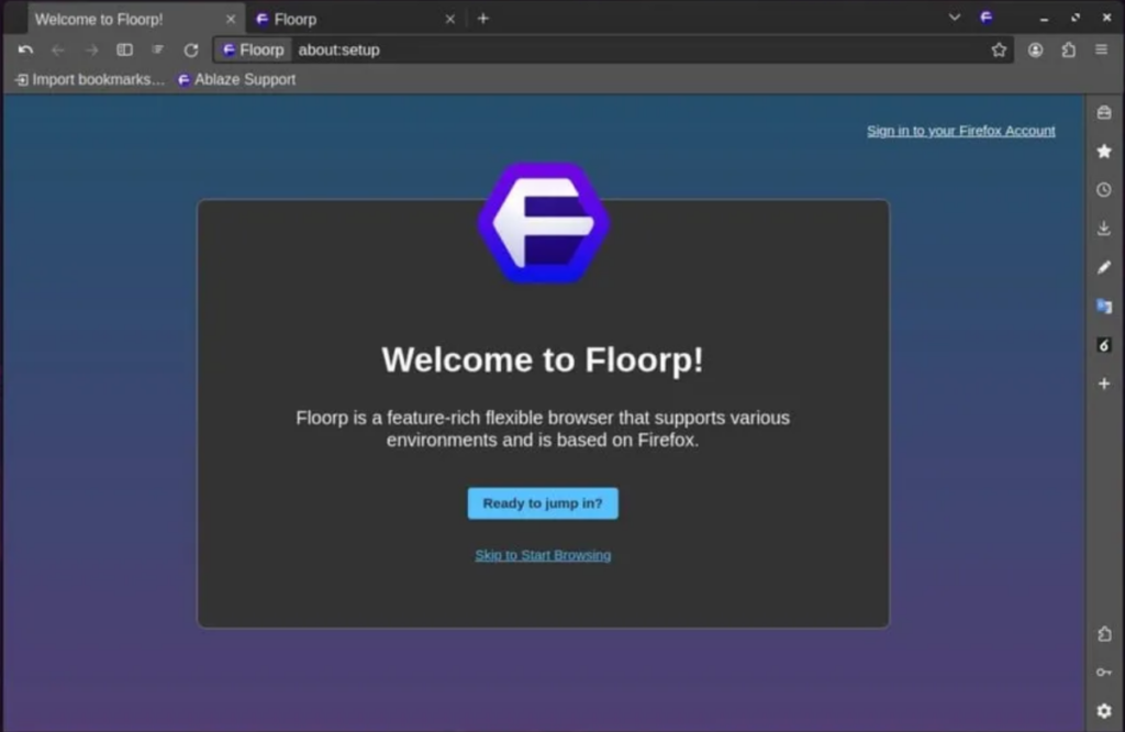
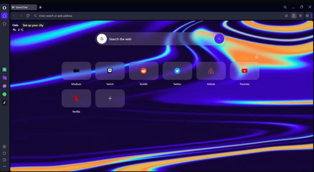
Fast forward 9 years later and the browser landscape has truly changed. Since most browsers are based on chromium and the occasional Firefox forks, new browsers must have a reason for their existence. If they do not, then the users become their purpose for better or for worse. Modern browsers are no longer just tabs an addressbar and icons but have taken from the feature-richness of Opera and the browser has become a centre for most people’s computing and workflows. This means more features and browsers becoming a gateway for their makers to offer services (Gmail, Google Earth, Brave Talk) and further different interests (advertising, web3, privacy, open web). For Vivaldi, it was immense functionality that adapted to different preferences and different workflows that would often be delegated to extensions. What were features exclusive to Vivaldi and Presto Opera are now already adopted by other browsers. Workspaces/tab groups, customization options and extendability have become essential for the modern browsing experience. Now Edge, Arc and SigmaOS have tab tiling. Chropera, Edge and Floorp have a sidebar for placing bookmarks, downloads and mobile versions of Websites like YouTube and Spotify.


Once running, now stale
As I’ve indicated, modern browsers have increased functionality and give more choice and control to the user either through extensions or built-in features. And with exposure to similar functionality on other browsers (Workspaces + Window Panel vs TreeStyleTabs/Sidebery, Vivaldi’s Ad Blocker vs uBO, Multi-account containers + Private Browsing + Profiles vs Profiles + Private Windows etc), Vivaldians will tend to recommend what they’ve come across as feature requests and be patient and appreciative but increasing shunning and a dismissive and “impossible” attitude could betray that.
Yes, maintaining a mere chromium fork is in itself tedious and something like Vivaldi even more especially with a small team compared to the MS Edge developer team or Google Chrome’s. But Vivaldi has shown what is possible even with the limitations of Blink and not using an independent Browser Engine like Presto or something else. They even had to brag about it in a blog ( https://vivaldi.com/es/onemillion/ ). It wasn’t some V fanboy or random browser nerd but actually the company itself; I mean, you can’t make this stuff up. This is not an accident but the point of Vivaldi.
When scouring through Vivaldi Forums, we find threads of unfulfilled feature requests over years raising questions and concerns. Regarding Multi-account containers, I can understand why this hasn’t been implemented yet as it requires modifying actual Chromium code of which can be a very tedious undertaking. As for features that deal solely with the UI such as Folders or Nested tab stacks, it is really hard to excuse how Firefox takes out Vivaldi’s lead. But Kjala very few people would actually use those features, someone would interject. Well, spend some time in Vivaldi Forums and look at the lengthy threads requesting for TreeStyleTabs/Sidebery-like functionality. Dismissing/not taking account of a desktop feature request thread with 17 pages is crazy.
My Thoughts on the current state of Vivaldi: Oblivion and identity crisis
While Vivaldi is a feature-rich browser compared to most, Vivaldi in it’s current state can only move forward by polishing on what it has already built. Vivaldi is now supposed to fulfilled the goal it was built on; what was once the sole specification of extensions could be replaced with built-in functionality. And what are extensions anyway? They are applications that are specialized for a specific purpose. Vivaldi is a combination of different applications. It is a blend of a tab and session manager, a download manager, an ad and content blocker, an email client, an RSS feed reader, an extensions manager, A notes application, a clock and alarm application, A syncing application, A translate application, a networking platform and community, a tab tiling application, a screenshot application, a devtools application, a PDF Reader/Viewer among other things. Applications provide alot of options and a polished user experience than features and should be the way Vivaldi should bring renewed interest and excitement around V.
Reimagining browser features
Here are my thoughts on Vivaldi’s applications and how they could be improved upon:
1. Tab management: In the space of tab management, the Tree Style Tabs Firefox extension is king. The concept of Tab stacks within tab stacks could be a game changer for Vivaldi’s tab management. This would make the Window Panel more useful as it would be possible to drop independent tab stacks within other tab staks rather than the dropped tab stack having it tabs absorbed into the receiving tab stack. In short Nested Tab stacking and some keyboard shortcuts/commands to accompany this.
2 Download management: Times come when I have to manually update installed applications or download images documents and stuff from repositories from GitHub and it would be nice to have this automated. I could just specify where a specific file format is supposed to be downloaded. Images got to the Pictures folder. Zips go to their specified folder. Executables and installation files go to their folder. And so on and so forth. But this wouldn’t disallow exceptions and manual downloading.
3.Adblocker – uBO level content blocking and functionality. Nuff said. And sites don’t break as much as it may seem from this post https://vivaldi.com/security/common-questions/#privacytests when using LibreWolf but simply makes sites load much faster since all analytics and tracking even on my old PC where applications take a minute or two to open.
4. Tab tiling – Just automatic tab tiling or forget about it.
5. RSS Feed Reader- The option to hide the RSS Feed entirely and not just the the feed ‘channels’ would be a better User experience especially for viewing YT videos without the algorithm.
6. Devtools – If you have checked out Firefox devtools, you’ll be amazed at how resourceful they are. I know of Vivaldi’s which are just Google Chrome’s and the experimental font editor but all that pales in comparison to Firefox Devtools. Firefox has a responsive design feature that helps developers test how sites are viewed on mobile devices. Ofcourse, Vivaldi’s CSS debugger in the page actions is a pretty neat feature though.
7. Translate – A userblog post indicated the flaws with Lingvanex which powers Vivaldi’s translation functionality ( https://quhno.vivaldi.net/2021/12/11/pregnant-with-passive-heater/ ). One should be able to change the translator to one of their choice.
8. Session manager – Look, I don’t know if you guys have ever thought of refreshing or starting a new session to freshen out and declutter with one button. I have
9. Blogs – Options for Monospace fonts such as JetBrains Mono, Fira Code Mono, Dank Mono, Space Mono. Neocities level customization with actual themes like Gruvbox, OneDark, Tomorrow Night, Hybrid theme, Nord, Dracula, Ayu, Monokai etc.
An addition
While I am firmly in support of marketing Vivaldi as a browser for everyone because it is the browser that adapts to the user (both the average Joe and the nerds and powerusers), in most cases newbies would have to be out of the average to search for, install and stick with something that’s not Google Chrome or MS Edge. You may not be not that nerdy or at all but maybe, maybe, in a certain direction, the chick is coming out of the shell. It’s a slippery slope to the world of Linux with all the browser reviews by Linux YouTubers, or the privacy part is what you’re going to slip into.
So what is it?
I am a ricer. I may not be really a poweruser. I know just enough terminal commands but not all of them, especially since I’ve got to master commands from more than two shells (Nushell, PowerShell, Bash&Zsh, Ksh). But I use a couple of programs that involve keyboard shortcuts. The OS I’m running has its own which I use everyday. The Window Manager has a couple of them. The terminals I use have a couple of them. My Run launchers have two of them. My File manager has one of them. And My main browser, Vivaldi of course, has a handful of them. Look, if you just think about it, I have too many keyboard shortcuts and I just wish I could reuse some for each application in Vivaldi. I propose a concept called Modes.
So, what are Modes?
Vim users or anyone who’s come across Vim knows this. Let’s say I want to use the Window Panel. My custom keyboard shortcut is Alt+W. So when I press that, I open it. Now with modes, I can press a certain keyboard shortcut which disables all others focusing on only keyboard shortcuts for the Window Panel which if are reused don’t trigger unintended actions from other parts of the UI. Of course if one wants to quit out of this Focus Mode and go back to the Generic Mode, he/she can just press the Esc button do exactly that. Sounds like a great idea doesn’t it?
So, Let the fun never die.
